WINDMAVEN
Demo Apps - TV & Mobile

Project
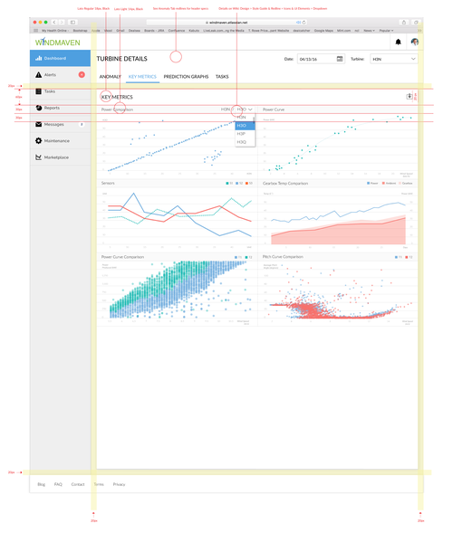
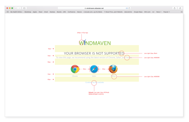
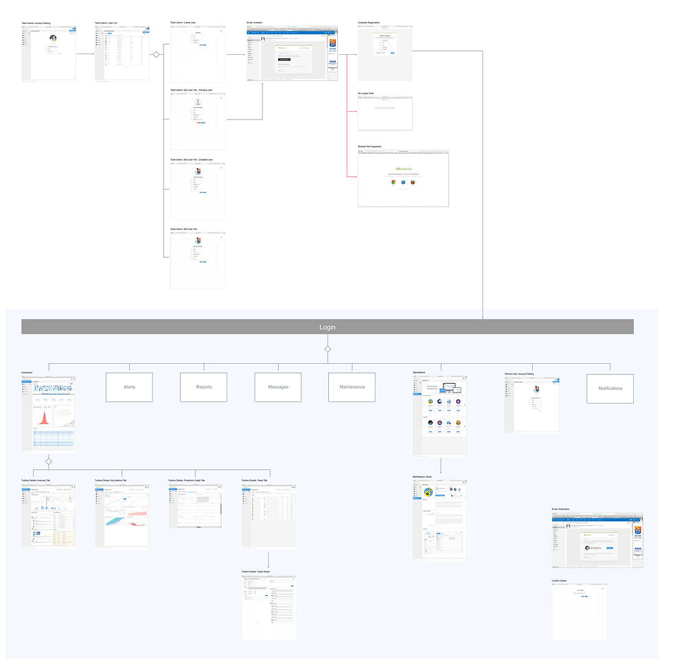
Windmaven is a trusted platform for sharing wind energy-related data between wind farm operators, researchers, original equipment manufacturers (OEMs), etc. I was invited to work on the project from the planning stage and was delighted to work with top-talent engineers, data scientists, and management. We met every morning for quick stand-ups and a weekly sprint to plan the tasks and discuss blocks/challenges. My contribution includes, but is not limited to, creating user flow, wireframes, and designing high-fidelity mockups, as well as creating redline specifications. We went through multiple successful POCs and now with the change of business models, Windmaven is in process of being part of a suite of data platform.

Challenge
The most challenging part was to come up with the best way to display the data. Since the user goal for this app is to see the wind data, be able to analyze it, and check for errors and maintenance schedules, we wanted the main focus to be the visualization of the data that helps users to easily recognize malfunctioning. The dashboard features overall average power for a wind farm, anomaly count, and wind farm health in percentages. Also, the heat map helps users to see the anomalies at a glance, detect unusual states right away. Being able to drag-select, or click on certain months and days allowed users to easily see the overall details of the wind turbine.
The perception of colors also played a great role in this project. For example, red in general means errors, and alerts, and green for clean energy and a healthy state in terms of maintenance. So I did multiple designs with different color themes to study how to best display data without creating much confusion.
Color Study


Visual Design


More Challenges...
Every time a new data set is included, we had to decide the best to show data. Researching different graphs, charts and tables was challenging but fascinating at the same time. But also with expansive graphs & charts, keeping up with the color theme was challenging. Also, the page was getting longer and longer, so we decided to incorporate tabs for better usability.


User Flow
Specifications